At Google Innovation Never Stops or Gee a G
October 10, 2025
 This essay is the work of a dumb dinobaby. No smart software required.
I read “Google’s Gradient G Icon Design Is Going Company Wide.” Usually Deepseek, the YouTube leadership, or a rando in advertising announces a quantumly supreme achievement. The stunning Google news for September 29, 2025, is presented this way:
Google used “brighter hues and gradient design” to “symbolize the surge of AI-driven innovation and creative energy across our products and technology.” The aim was to stay “true to Google’s iconic four colors,” with the last design refresh taking place 10 years ago.
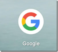
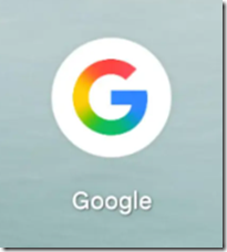
The article includes the old G and the new forward leaning, innovative, quantumly supreme G. Here’s what I saw in the cited write up:

This is the old, backward leaning, non-innovative, un-quantumly supreme G.
Now here’s is the new forward leaning, innovative, quantumly supreme G:

That is revolutionary, boundary stretching, Leonardo DaVinci grade art.
I am impressed. Imagine the achievement amidst some staff concern about layoffs, and the financial headaches resulting from those data center initiatives, crypto services, and advertising sales efforts.
What’s next from the Google? Gee, this new G will be difficult to galvanize more grandiose game changers.
Stephen E Arnold, October 10, 2025
Comments
Got something to say?


