Google Makes a Giant, Huge, Quantumly Supreme Change
May 19, 2025
 No AI, just the dinobaby expressing his opinions to Zellenials.
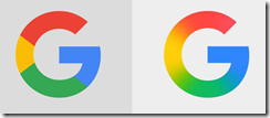
I read “Google’s G Logo Just Got Prettier.” Stunning news. The much loved, intensely technical Google has invented blurring colors. The decision was a result of DeepMind’s smart software and a truly motivated and respected group of artistically-inclined engineers.
Image. The old logo has been reinvented to display a gradient. Was the inspiration the hallucinatory gradient descent in Google’s smart software? Was it a result of a Googler losing his glasses and seeing the old logo as a blend of colors? Was it a result of a chance viewing of a Volvo marketing campaign with a series of images like this:
Image is from Volvo, the automobile company. You can view the original at this link. Hey, buy a Volvo.
The write up says:
Google’s new logo keeps the same letterform, as well as the bright red-yellow-green-blue color sequence, but now those colors blur into each other. The new “G” is Google’s biggest update to its visual identity since retiring serfs for its current sans-serif font, Product Sans, in 2015.
Retiring serifs, not serfs. I know it is just an AI zellenial misstep, but Google is terminating wizards so they can find their future elsewhere. That is just sol helpful.
What does the “new” and revolutionary logo look like. The image below comes from Fast Company which is quick on the artistic side of US big technology outfits. Behold:
Source: Fast Company via the Google I think.
Fast Company explains the forward-leaning design decision:
A gradient is a safe choice for the new “G.” Tech has long been a fan of using gradients in its logos, apps, and branding, with platforms like Instagram and Apple Music tapping into the effect a decade ago. Still today, gradients remain popular, owing to their middle-ground approach to design. They’re safe but visually interesting; soft but defined. They basically go with anything thanks to their color wheel aesthetic. Other Google-owned products have already embraced gradients. YouTube is now using a new red-to-magenta gradient in its UI, and Gemini, Google’s AI tool, also uses them. Now it’s bringing the design element to its flagship Google app.
Yes, innovative.
And Fast Company wraps up the hard hitting design analysis with some Inconel wordsmithing:
it’s not a small change for a behemoth of a company. We’ll never knows how many meetings, iterations, and deliberations went into making that little blur effect, but we can safely guess it was many.
Yep, guess.
Stephen E Arnold, May 19, 2025


